GO Time
Overview
GO Time is an app for young adults looking to find events in the city they are living in. By looking through a database of activities, users are able to plan things to go do with friends or meet new people. Go Time promotes connectivity and living a fun, active lifestyle.
Challenge
As a young adult who just moved to a new city, I know how challenging it can be to find activities to do. My challenge was to create an app that everyone could use to find local events. This extended to the type of phones used. As an iPhone user, I was more acquainted with iOS guidelines, so I was challenged to learn about Material guidelines and design.
Solution
Before starting the wire-framing process, I spent a lot of time learning about Material design guidelines. I compared and contrasted navigation, buttons, typography, cards, and elevation elements between Material and iOS design. By adhering to each design system’s guidelines, GO Time is able to be more effective on whatever platform it is on.
My Role
User Persona
Based on my field research for the app’s potential audience, I created a user persona to depict the probable user. Jeremy represents young adults who are relatively new to whatever city they are in. He just landed his first job and is looking for activities to do when he is not working. He is very sociable and is looking to meet new people by trying new things and attending different events throughout the city.

User Flow Diagram
I designed screens for 3 key functions. Users will be ale to create an account and choose their location, filter their results, and purchase a ticket.

Wireframing
After learning about the main differences between iOS and Material design guidelines, I designed my low-, mid-, and high-fidelity wireframes. Before stylizing my high-fidelity wireframes, I performed user testing. All of the testing ran smoothly ensuring the app was user friendly.

Visual Design
After completing my wireframes and user testing, I stylized my screens. iOS design uses the font San Francisco, while Material uses Roboto. I used the same color scheme for both types of design. For the logo, I decided to do a pin to indicate location since the app is all about exploring where you are.

Prototyping
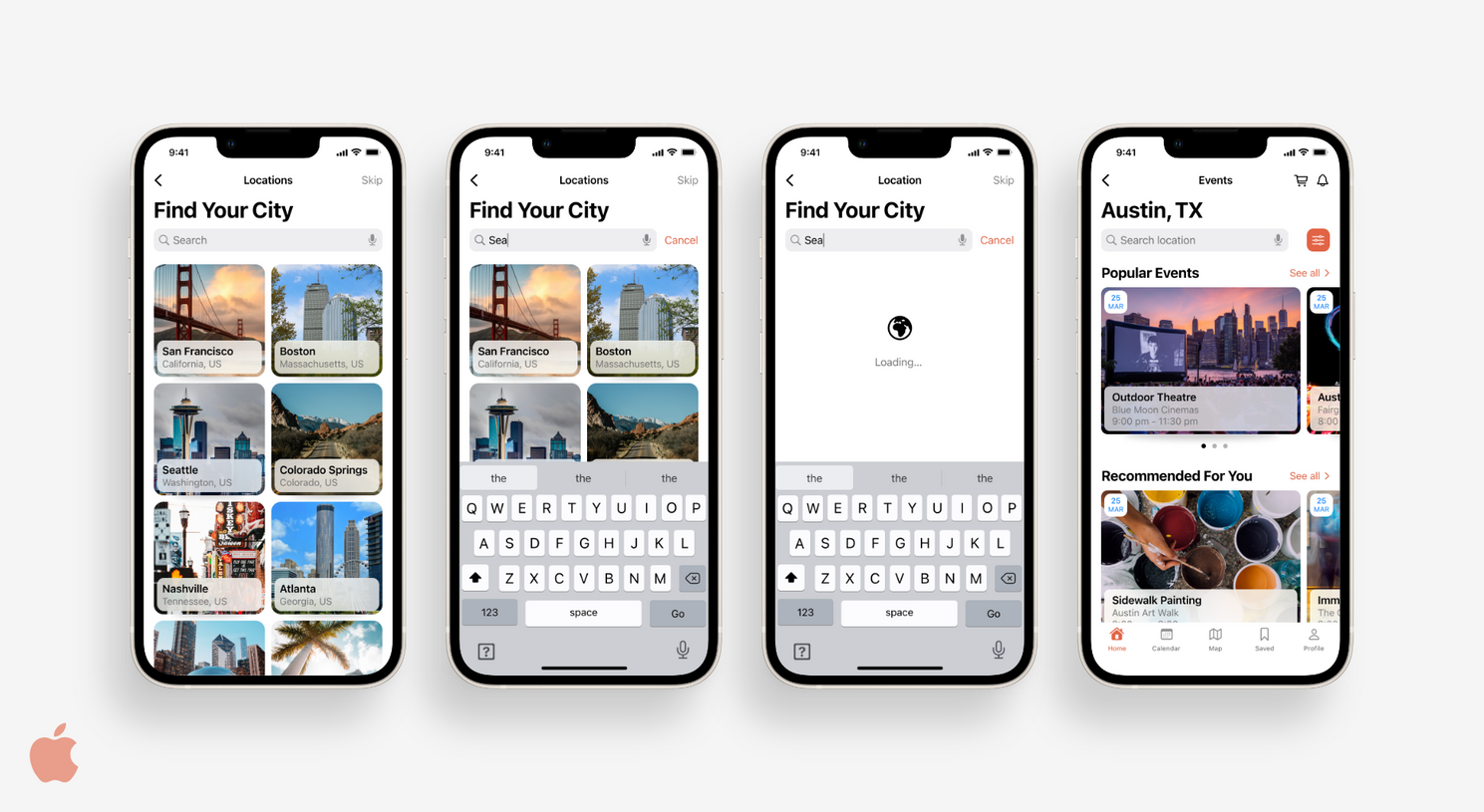
Below are my final designs for both iOS and Material. I am happy with the results and the distinction between the designs. They both adhered to the design guidelines for both platforms. Having 2 different designs makes the user experience better on both platforms and extends the scope of how many people can use the app.


Define
During the define stage of the process, I laid out who will use the app and what the app will do.
Refine
After I defined what the app will do and the differences between iOS and Material Guidelines, I was able to make two sets of wireframes. One set adhered to iOS guidelines and the other adhered to Material guidelines. Once I generated wireframes, I tested potential users to evaluate how intuitive my app was. With feedback from users, I made any necessary changes to my screens before moving onto the visual design.
Design
After refining my screens, I moved onto stylizing them. Following iOS and Material guidelines, I applied a style to each platform's wireframes.
User Testing
Everything went smoothly during user testing ensuring the app is ready to move forward in the design process.
Tools & Methodologies

Discovery
Cross Platform Comparison
Challenge
Solution

Define
User Persona
User Flow Diagram

Refine
Wireframing
User Testing

Design
Visual Design
Prototyping
Process
Reflection
I learned a lot about Human Interface guidelines and Material guidelines throughout this project. In retrospect, I would have done more research of both before I ever started designing screens. I did more research in the later design phases which made things more difficult.
As an iPhone user, I still have a lot to learn in terms of Material guidelines. I now see how important it is to look into the design guidelines for native apps. Material design looks vastly different from Human Interface, and it would be confusing for users to see the wrong type of design on their screens. This taught me the importance of considering the context in which users are viewing an app and how that might affect the design.
Discovery
During the discovery phase, I performed preliminary research. Given that I was designing an app for both Apple (iOS) and Android (Material) devices and didn't know much about Material guidelines, it was important for me to do research before moving forward in the design process. I performed a cross platform comparison to learn about the differences between iOS and Material guidelines, so the app's interface would match the devices' native interfaces. After performing a cross platform comparison, I search for challenges among users and proposed a solution.
Check Out More of My Work!
Cross Platform Comparison
For this project, I designed screens for both iOS (iPhone) and Material (Android). As an iPhone user, I know more about iOS design than Material design. I did a deep dive into comparing the design guidelines for the 2 platforms. Below are the main differences from my findings. In hindsight, I could have done more research between the design platforms. For future projects, I will go more in depth with my research before designing screens. It is really important to extend your designs to more than one platform because it allows more users to use the app.


