The Social Chef

Discovery
Challenge
Solution

Define
User Personas
User Flow Diagram

Refine
Wireframing
User Testing

Design
Style Guide
Visual Design
Define


Refine
Overview
The Social Chef is a recipe website that suggests recipe pairings to create the perfect menu. This takes all of the guesswork out of deciding which dishes go together and allows users to feel confident in their menu.
My Role
Challenge
When planning an event, such as a dinner party, people often struggle composing a menu. It’s stressful and time consuming to plan a dinner party; people don’t have time to figure out which dishes go together. There needs to be a practical site that does the job for them.
Solution
The Social Chef alleviates the stress that comes with planning an event by making recipes and menus easily accessible. The Social chef provides a wide variety of recipes of multiple cuisine types and suggests recipes that pair well together. Additionally, the website offers convenient pre-made menus or guides users to create cohesive menus if they are interested in making one themselves.
User Flow Diagram
I created 3 key functions this web app will perform. Users will be able to create an account and personalize their experience, save recipes and access them later, and create and name menus. Each of these functions is represented in a flow chart that includes all of the screens involved in performing the particular function.
Wireframing
After mapping out user functions, I began creating wireframes. I made lo-, mid-, and high-fidelity wireframes for 4 different screen sizes. Each screen has 4 different responsive breakpoints: phone, tablet, laptop, and desktop.
User Testing
Once I completed my wireframes, I did usability tests to ensure my designs were user friendly before moving forward. I gave 5 participants the tasks of searching for recipes by cuisine and type of course, creating a personal menu, and accessing and sharing a menu. In doing so, I found out my menu set up was not intuitive to users. By doing user testing I was able to fix this error by changing some wording and adding a feature.
Style Guide & UI Design
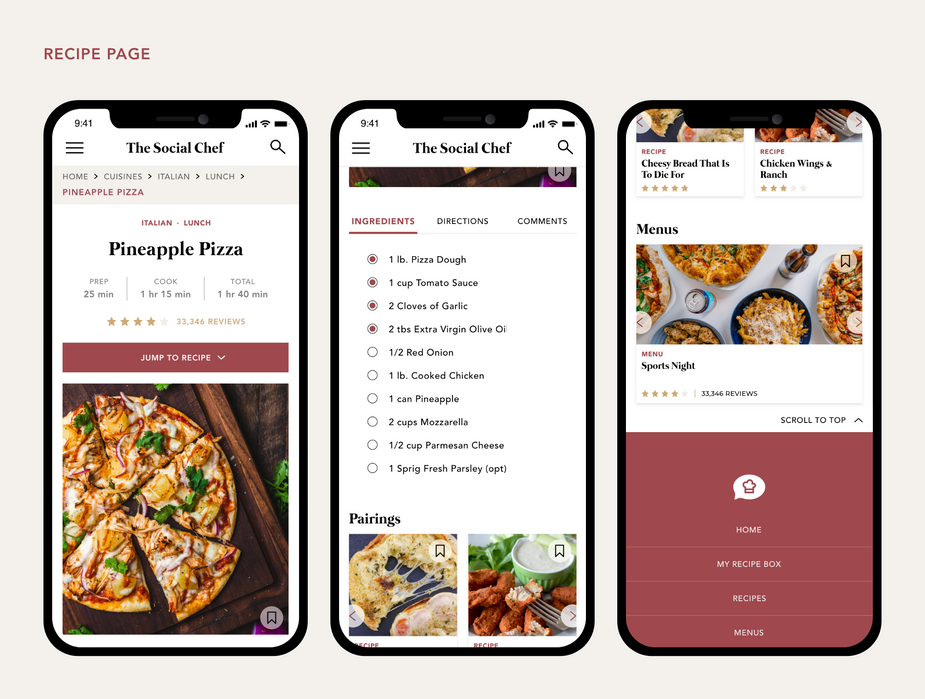
This is the final phase of the design process. After correcting suggestions made by participants from the usability tests and ensuring everything ran smoothly, I was able to stylize my designs. Given that the app is for planning dinner parties, I wanted a sophisticated color scheme, so I went with wine and gold tones. I used imagery that had pops of these tones. I did darker imagery as well to mirror the intimate feel dinner parties often give. Below my style guide are my final screens for the smallest breakpoint.

-
Enter the app
-
Click on the menu tab and choose “Recipes”
-
Scroll through the cuisines or type a specific cuisine in the search tab
-
Scroll through the types of courses and choose one.
Search for recipes by cuisine and type of course.
01
All of the participants were able to search for recipes by both cuisine and type of course without any trouble. They chose a cuisine, then chose a specific cuisine.
-
Click the hamburger icon and choose “My Menu”
-
Click “Add Menu”
-
Enter a name for your menu and click “Confirm”
-
Scroll through the recipes and choose which items you want on your menu
-
Click “Save Menu” button
Create a personal menu.
02
All of the participants clicked on “Menu” instead of “My Menu.” No one went to the correct place.
No participants were able to add or save a menu.
-
Click the hamburger icon and choose “My Menu”
-
Scroll though the menus and choose one
-
Click the share icon and choose where you want to share your recipe.
Access and share a menu.
03
All participants were able to access their menus without difficulty. They were also able to share their menus with ease. A few participants suggested adding a Pinterest button and a printing button for convenience.
User Personas
Based on my field research for the app’s potential audience, I formulated 2 examples of potential users. First, there is the young adult who just moved to a new city and is eager to meet new people. Who doesn’t love to bond over food? Secondly, there is the young to middle age adult business man or woman who has to throw dinner parties for potential clients.


Tools & Methodologies

During the define stage of the process, I set the foundation for the app’s design. I defined who the app's target users will be through user personas and what functions the app will perform through a user flow diagram.
During this stage of the design process, I generated a blueprint for how the app will be structured through wireframing. After creating wireframes, I performed user testing to access the app's usability and get feedback from users. With the given results and feedback, I refined my wireframes before moving further into the design process.
Design
After I refined my wireframes, I designed a style guide that contains guidelines for color, typography, UI elements, and imagery usage. Once I established the guidelines, I applied the visual design to my screens.
Process


Since users clicked on "Menu" instead of "My Menu" to make their menus, I decided to change "My Menu" to "My Recipe Box." Additionally, I decided to add a "Home" tab.
-
Users can return to the home screen no matter what screen they are on.
-
There is a more clear distinction between where users go to access menus or create one (Menus) and where they go to view their saved recipes or menus (My Recipe Box).
Originally, the feature that allowed users to make their own menus was under "My Menus." However, every user clicked "Menus," so i decided to move the feature under "Menus."
-
Users will immediately see where to create a menu once they click onto the Menu page.
Some participants suggested adding more sharing options.
-
Users can share a menu they have created or saved. They can also save a menu to Pinterest or print it off.
Reflection
Upon user testing, I realized my menu feature was not at all intuitive. Every participant struggled with navigation. This had the biggest impact on my final design by allowing me to pivot and make my app much more intuitive for users. I completely redesigned those screens and added a few features that cleared things up a bit.
If I could, I would manage my time better. I struggled with time management and knowing when to stop obsessing over every little detail. I am a perfectionist and constantly want to make things better but at the cost of finishing my project in a timely manner. If I could go back, I would have stopped second guessing myself. Additionally, I would have done more in depth research during the UX portion of this project. I would have also looked at more inspiration before curating my wireframes.
Discovery
The first stage of the process was discovery. During this phase I researched other recipe websites to discover challenges faced by users. Once I identified a challenge, I presented a solution.


